Fruits’n Tails Game
This game was created and developed at Mukutu Game Studio and I was responsible or directly involved in the main aspects of it: Art Direction, UX, Game Design / Development and general project / team coordination. Crafting a game is something incredible for me and I’ll talk a little bit more about my job and what I did during this project.
Game concept and story background
These are two areas that I’ve not participated directly: The game concept creation and the background story.
Fruits’n Tails was our first IP and we had brainstorming sessions to choose a nice game concept to work on top of it. The chosen one was: “Four monkeys, one at each corner of the screen, they will use their tails to interact with the elements in the center of the screen”. A simple but promising concept.
The story of the game basically is: Leonardo da Vinci is in a creative block when he finds a map that leads him to a mysterious mountain, where he meets the colorful monkeys and gets their help painting a new portrait, his new masterpiece.
A context for a game is important and storytelling can actually save a game from going straight to the store’s limbo, so we have this simple story for Fruits’n Tails. The story background also helped us to think about game elements and art style but I found that the most impressive aspects of this game for the players (based on their feedback) is the colorful design, the level of polishing and the innovative mechanics. This is actually a constant to almost any casual game, and even more to a casual puzzle game.
I had the mission to transform this ideas into a real game.
My journey through the “crafting” of this amazing game
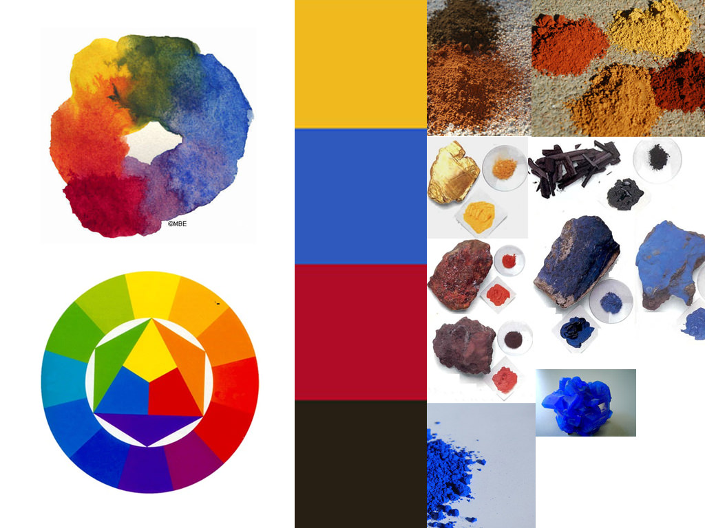
The first thing that I had to do was research for art materials, minerals and colors that was commonly used at the Renaissance period, the main goal was to define the character, enemies and items colors and the overall game aesthetics. I’ve came up with these four colors at the center of the image below:
Yellow – Happy, fun, optimistic, playful, sunny, optimism, wisdom, warmth, spirit, action, successful, open, vivid.
Blue – gentile, quality, solid, traditional, Trust, calm, stability, serenity, cold.
Red – Alert, activity, life, passion, power, excitement, determination.
Dark gray – Importance, gravity, mysterious, smart, powerful, exclusive and the mix of the previous three.
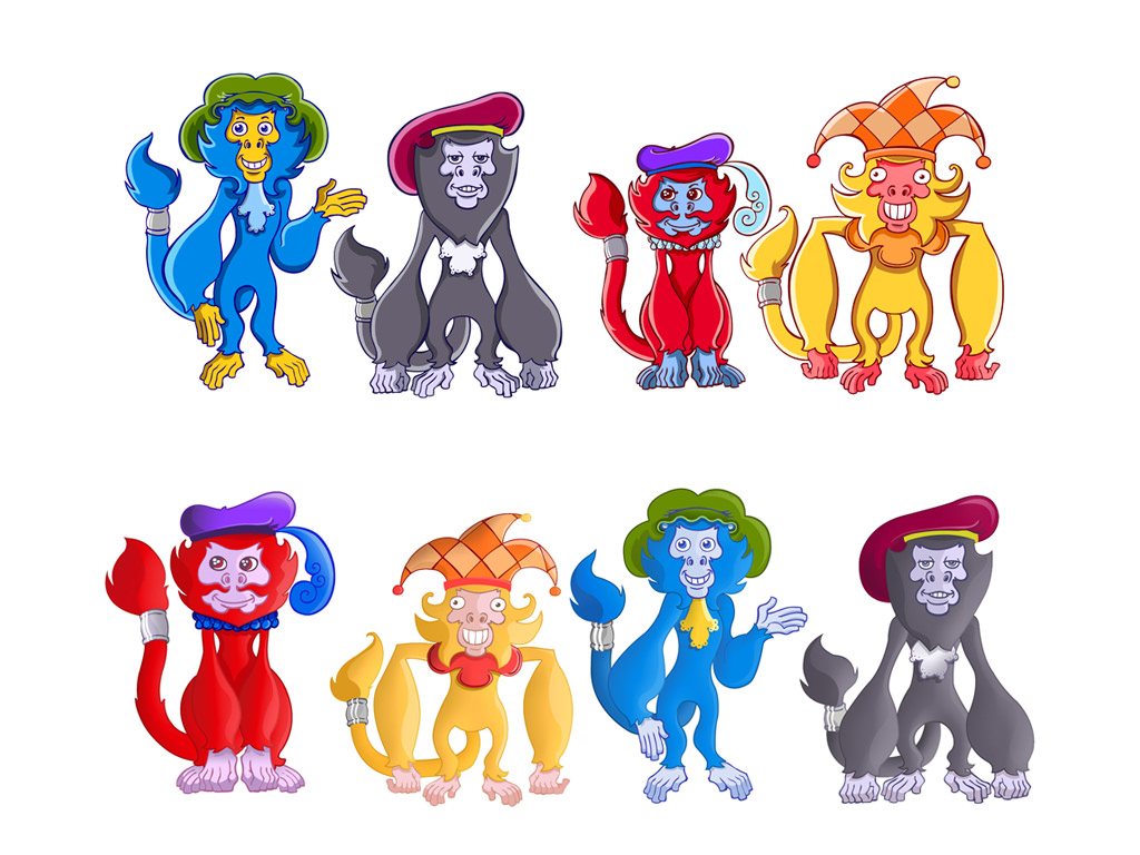
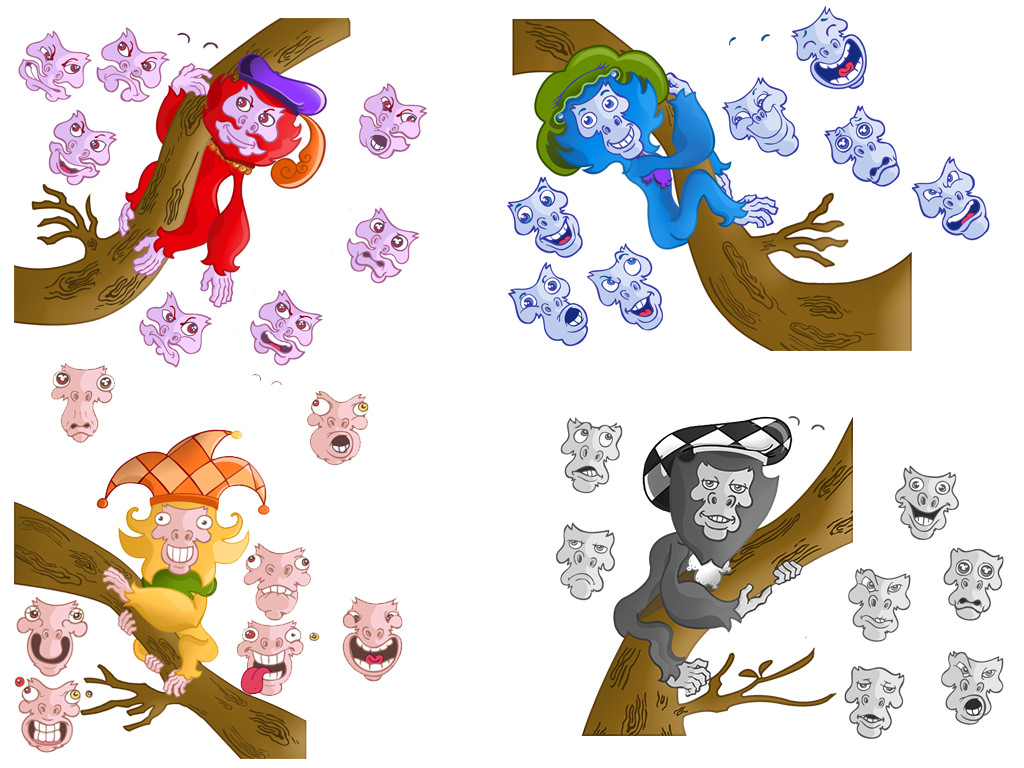
After defining the main colors, our illustrator painted the characters and the last line of characters represent the final result, after my direction (image below). He also made a huge research to find elements, such as the hats, fur style and accessories, to make the characters more adequate to the renaissance period and also created their personalities.
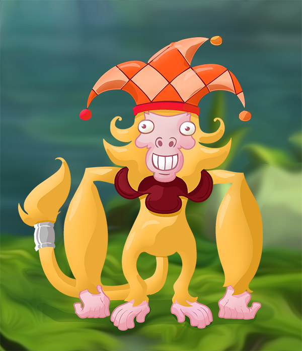
The images below are painting style guides that I’ve made:

As we moved on with the art assets I was also developing our prototype to confirm if our game concept was going to work as expected. It turns out that I’ve changed and created a lot of the main game mechanics and overall gameplay elements at this phase, for example: the basic interaction with items and enemies, the color mixing feature, the combos (Chain, Super and Mega Chain, Lightning Fast and Best Path), the enemies behavior, the tail length limit (indicator on the top of the game) and so on. We had a LOT of meetings to define and validate this changes, we have created so much mechanics and items that our deadline was incredibly compromised so we had to reduce it to a MVP (Minimum Viable Product).
This was one of the greatest learnings that I had during the development of Fruits’n Tails: Allow yourself and your team to create crazy things, don’t be limited by technical constraints, but keep in mind that this Brainstorming process need to have a deadline. After that you’ll have a richer set of elements to choose compared to those that you’ll have if you didn’t made this creative process.
After some months we had the first playable and polished version of the game and we organized a Beta Testing event. We had near 30 people in our studio, playing and interacting with us, giving feedbacks etc. It was a great experience to watch them playing and learn about some problems and some unseen potential new mechanics for the game.
After the event we had enough data to make some adjustments like the one below. If you compare this characters image with the one above you’ll notice that the colors of the characters accessories changed: now they are “hidden” hints for the players to indicate which color will result after a mix.
This was mainly necessary because the result of the mix between any monkey with the gray monkey, Sanzio. In the real life, if you make this mix, you’ll have a brownish horrendous color, which may remember another thing :), so we’ve decided to use a white color, a **special** color and this gray monkey, Sanzio, turned to be the most old and wise of the four monkeys … that’s it, brownish-shit-looking color problem solved 😉
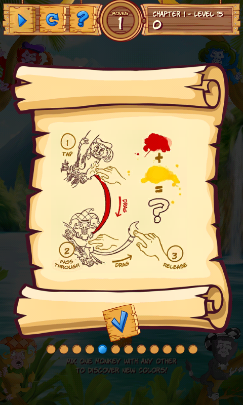
I’ve also created the tutorial images for the game. I know that a really good game don’t need tutorials, the experience just flow naturally but in this case we have some complex interactions that are not much intuitive. For example: during the internal Beta Testing process I’ve found that a lot of them was trying to mix the colors using two fingers at the same time, so for the external Beta Testing, I’ve created some images to exemplify how to interact and as result every player learned how to mix the colors properly. The most important thing is that the feeling of discovery was still there, even with the characters accessories hints they felt the discovery of color mixing. This is a must have in any game, people must have things to learn and discover by themselves.
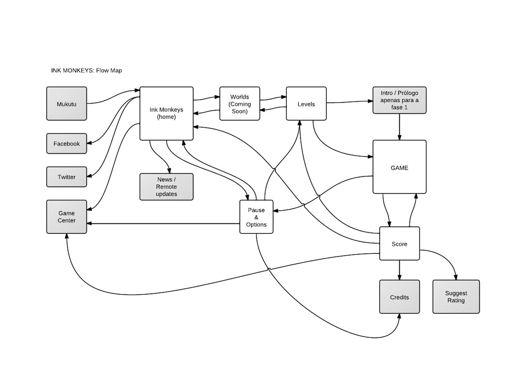
Here’s the first basic game architecture that I’ve made:
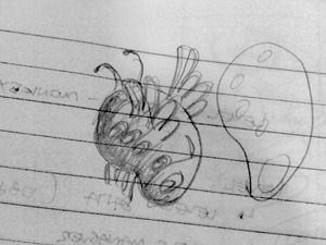
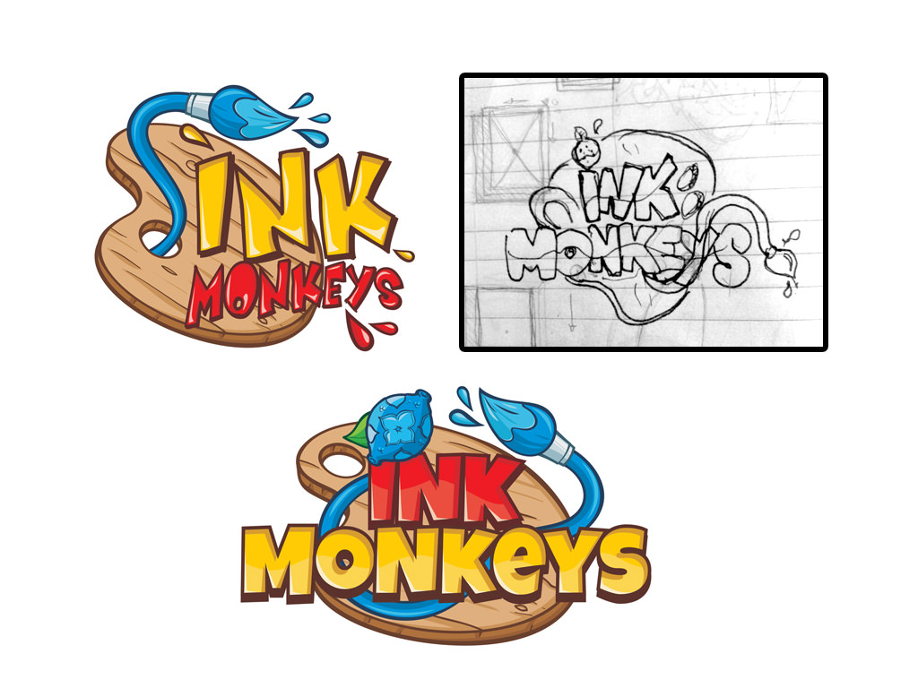
The game logo creation: the initial version, my sketch and the final version (In the first version, the game name was Ink Monkeys, but we changed it to Fruits’n Tails later)
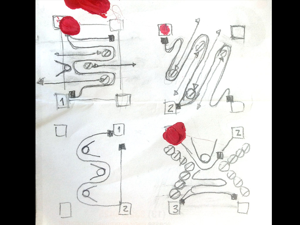
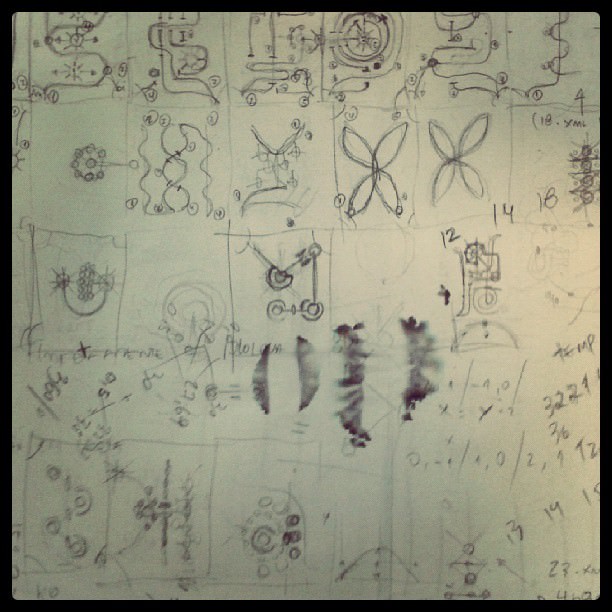
My sketches for Level Design. In the first version of the game I’ve created some levels and defined what approach we will use (a increasing sawtooth pattern), in the second version I’ve created almost all of the 96 levels that we currently have in the game.
Just before our first launch we won a contract with a big publishing company to publish the game and was an incredible learning experience because I was the direct contact with their producer. Unfortunately – or not – they canceled the contract last year (Basically because the game’s business model was / is outdated and we got no time or money anymore to make the needed changes in the game) so we launched the game independently.
One of the changes that I made during this process was to reduce the difficulty of the initial gameplay which was a publisher request: make the game easier, actually a LOT easier because “we need to achieve more downloads”.
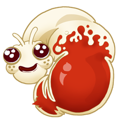
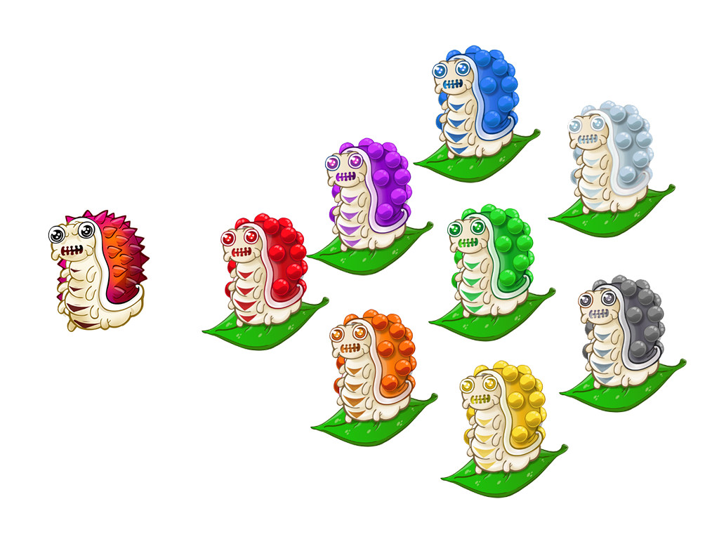
After some balancing between what we want to achieve with the game and what the publisher wanted to achieve we came to an agreement. There was a particular problem with one of the enemies, which is still called “Moloch”, and I came with the following change in the gameplay: Instead of exploding thorns everywhere and destroying everything around, Moloch will explode into paint pellets and now it will paint the items around it. This change provided a more flexible Level Design, more intelligent challenges and an overall improvement in the game experience.
Well, of course there are a LOT more of details that I could put here but this post will be even more long.
Here’s Fruits’n Tails final gameplay video:
Fruits’n Tails – Gameplay from Mukutu Games on Vimeo.
Final facts:
This was my first project with Unity3D, C# and was my first experience with Mobile too, so it was a nice challenge and I had great time during this process. This was also a great team work, which involved near 10 people direct and indirectly in several areas such as Sound Design, Planning, Production Management, Writing, Animation, Programming, Art, Storytelling etc and the results that we got with this game so far are obviously “fruits” of their work too 🙂
The game was launched at October / 2013.
We won a National Award with it in 2013: http://premiobr.io/brio-2013-resultados/
The game got featured in BlackBerry Latin America and Samsung Apps world wide through 100% Indie.
We are at top 50 in the world @ SlideDB 2013.
We are finalists at Indie Prize Showcase / Casual Connect Amsterdam 2015.
You can find more about Fruits’n Tails here: http://fb.com/fruitsntails and here http://www.fruitsntails.com
* This blog represents my opinion, not the opinion of the company or those that are working there.

